Table of Contents
ToggleDesign That Speaks: How to Create Meaningful Visuals
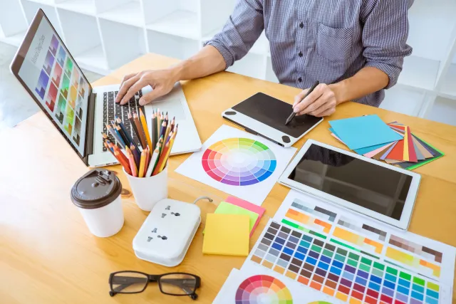
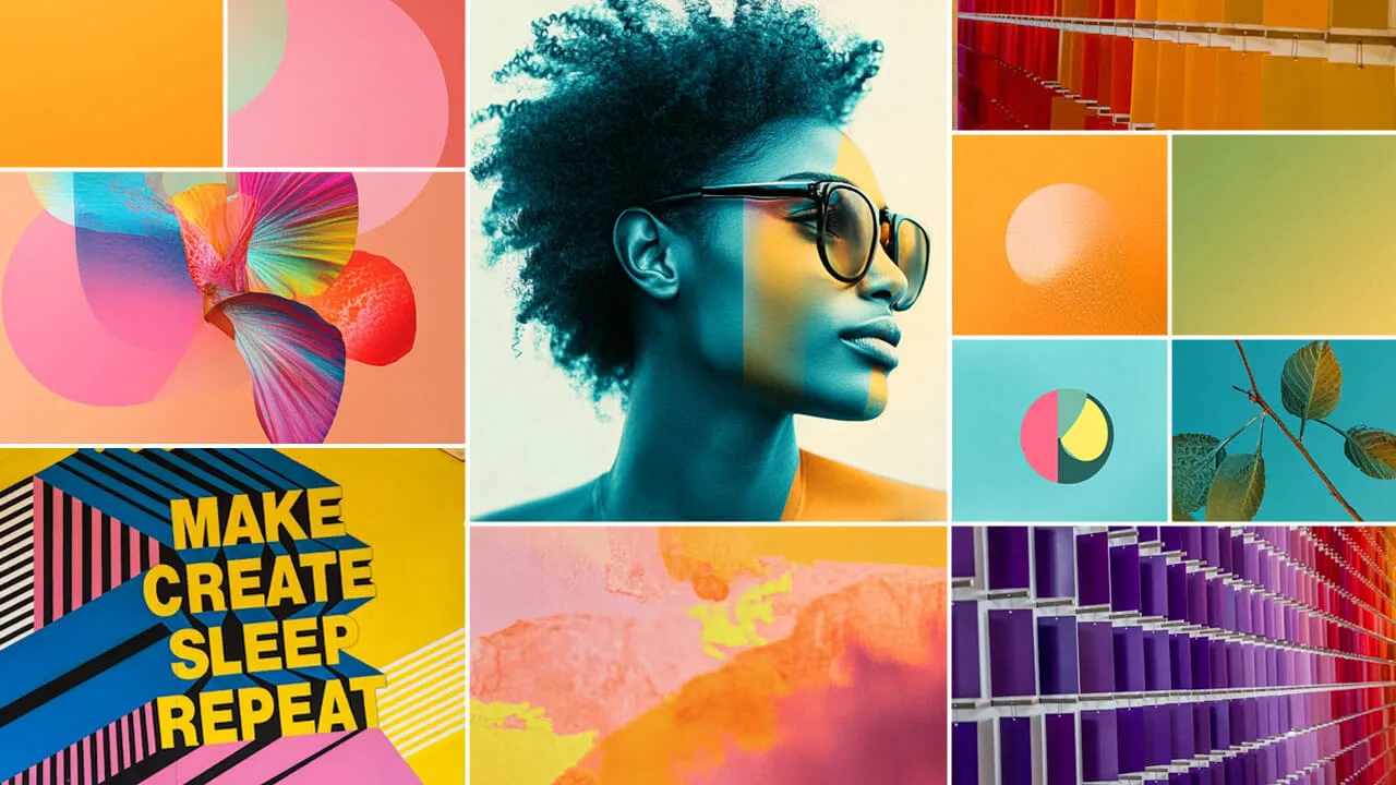
In today’s visual world, design is often the first impression — and sometimes, the only chance to communicate a message. But what separates a beautiful design from one that truly speaks?
Meaningful design goes beyond looking good. It tells a story, connects emotionally, and communicates clearly. Whether you’re creating a brand identity, a social media graphic, or a poster, your visuals should carry intention.
Here’s how to create designs that don’t just look nice — but say something real.
1. Start With Purpose
Every great design begins with clarity. Before diving into tools or aesthetics, ask yourself:
What is the core message?
Who is this design for?
What should the viewer feel or do?
Your purpose becomes the anchor. Every visual choice — color, font, layout — should support it. If your design has no clear intent, it’s just decoration.
2. Use Color With Meaning
Colors are emotional triggers. They can attract attention, influence mood, and convey brand identity.
Examples:
-
Red: passion, urgency
-
Blue: trust, calm
-
Yellow: creativity, energy
-
Black: sophistication, power
Use color intentionally, not just based on trend or preference. Think about what your audience will feel when they see your palette.
3. Let Typography Talk
Fonts have a tone of voice. The right type can enhance your message — the wrong one can distract or confuse.
General guidelines:
Serif fonts = tradition, reliability
Sans-serif = modern, clean
Script or decorative = emotion, creativity
Limit yourself to 2–3 fonts per design to keep it balanced and readable.
4. Use Visual Symbols Wisely
Visual metaphors and icons help simplify complex ideas. For example:
A mountain = challenge or growth
A chain link = connection
A leaf = sustainability
But avoid clichés. Look for unique interpretations or subtle symbolism that fits your message. Symbols work best when they feel fresh, not overused.
5. Follow Visual Hierarchy
Your design should guide the viewer’s eye. Use contrast, scale, and spacing to emphasize what’s most important.
Tips:
Make the headline or focal message pop
Use size or color contrast to direct attention
Use white space to avoid clutter
A clear hierarchy ensures your message is understood fast — often within seconds.
6. Design With Cultural Awareness
Meaning isn’t universal. Colors, symbols, and even gestures have different meanings across cultures.
Design with your audience’s context in mind. Something that looks clever to one group may confuse or offend another. The more you understand your audience, the more powerful your message becomes.
Final Thoughts
Design that speaks doesn’t shout — it connects. It communicates clearly, emotionally, and with purpose. In a world overflowing with content, meaningful visuals are what cut through the noise.
So next time you design, ask yourself:
“Am I just decorating — or am I saying something worth seeing?”
